Title Ideas
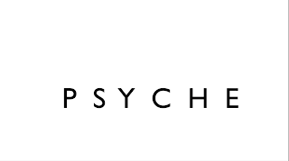
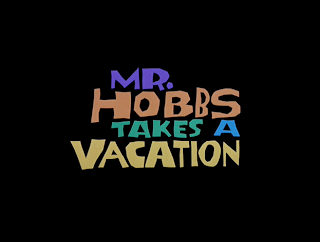
Following are some of the ideas of the titles we are going to use for our film opening. I have done some research on the types of fonts that should be used on our genre- psychological horror. We could use typical fonts with blood dripping, but this fits with gory horror and that is not the kind of idea we want to send across. We want quite a simple font, so it won't take away the attention from the video itself. The photos i have embedded are all ideas of the types of fonts we will use for the titles and credits and everything that needs to be typed. these will be displayed with a black background most of the time, with the odd exception at the end with the credits, when it will fade into white and say 'the end', and this is when it will fade into black and the credits will be shown with white writing on a black background. These two title fonts, although different from each other in writing style share the feature of having used different colours. The colours help to give a different meaning to the whole text and the image that can be associated with it by anyone viewing it.
i spoke to some people in my media group about which they felt fit the narrative better, and they felt that the first two ones with the white background fit the narrative the best. they believed the coloured ones took away attention from the narrative and the images, because they are quite prominent and it causes a lack of attention from one thing. Other people also agreed, saying that a simple idea was probably better because it portrays the image of being well thought-out, but still simplistic.


No comments:
Post a Comment